A Report on Display Accuracy Evaluation
The color calibration industry has progressed through a number of methods of evaluating the color rendering accuracy of video displays. Early methods of visual color comparison transitioned to electronic analysis of color differences then, recently, back to an advanced method of visual color evaluation.
This report examines the early use of optical comparators for visually evaluating color differences and the later use of electronic measurements to numerically model the color difference response of human vision. We then present an advanced method of using electronic measurements to provide a direct visual comparison between an expanded selection of desired target colors and a display’s actual measured colors. We present an innovative method of representing extremely intuitive color comparisons to evaluate the color accuracy of displays.
Early Color Evaluation
Early CRT-based video display users often wanted to evaluate and adjust their display’s color rendering accuracy, though many display users did not have access to or could not afford color measurement instruments.
Early Optical Comparators
A display’s monochrome grayscale is the foundation for accurate rendering of all other colors, and since the primary colors produced by CRT displays were fairly consistent, a display’s grayscale reproduction was the primary performance consideration.
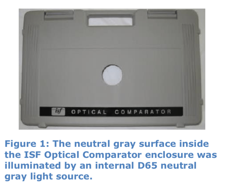
Early display users and calibrators determined that they could visually compare their display’s grayscale colors to the color of a neutral gray or white surface that was illuminated by a known light source. This reference target, known as an optical comparator, allowed users to visually check and/or adjust their displays for accurate grayscale rendering.
Different optical comparator designs were custom created and some were reproduced for retail sale. Popular retail models were available from The Imaging Science Foundation (ISF Optical Comparator) (Figure 1) and TVS Pro (The Visual Standard), among others.
Another solution was to use a Sony PVM-96 reference D65 studio monitor as an optical comparator (Figure 2). The CRT phosphor material for the Sony 9” B/W monitor contained a mixture of standard red, green, and blue phosphors, rather than monochrome phosphor material. The phosphor mixture was precisely controlled to produce D65 colored light.
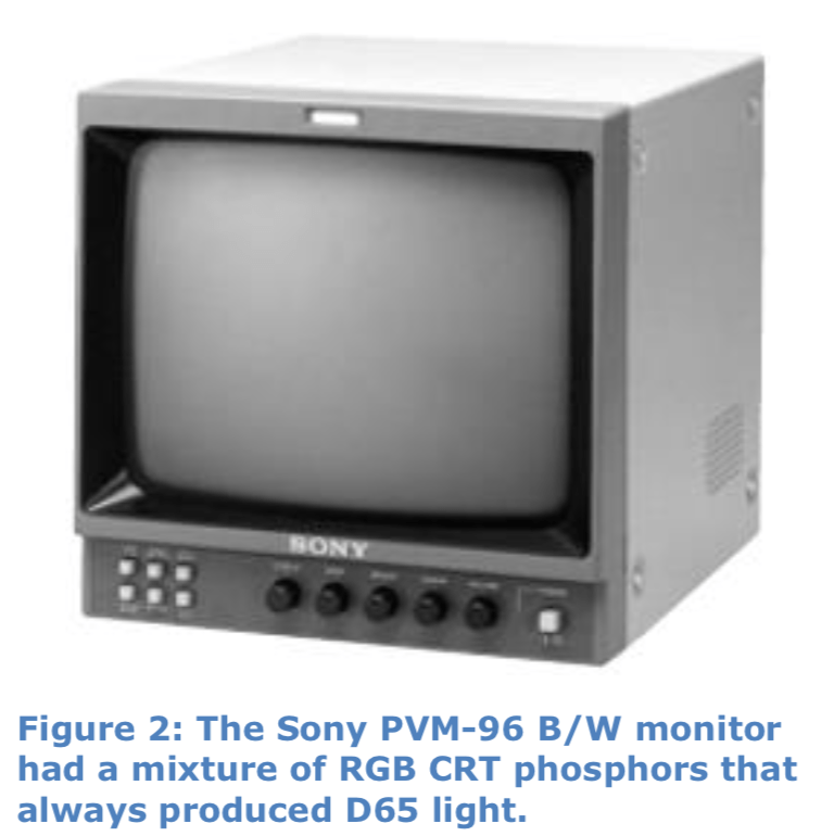
The Sony monitor was usually positioned just under the monitor or projector screen under test, for convenient direct visual comparison.
Modern Optical Comparator
The ISF HDTV Grayscale Optical Comparator app is currently available to run on Apple iPhone and iPad devices that have a Retina display. This portable optical comparator allows a video display user to very easily and quickly perform a visual check of the accuracy of a display’s grayscale, one of the critical display parameters.
Using Optical Comparators
To test for accuracy in this way, an optical comparator is positioned within the same field of view as the display to be evaluated or adjusted. The direct visual comparison allows the color of gray light produced by the display to be adjusted until it matches the color of gray light produced by the reference optical comparator.
This direct visual comparison uses the human visual system to decide whether the adjusted performance of a display is sufficiently accurate. This method is able to produce accurate and consistent results, with minimal investment.
Optical Comparator Strengths
- Intuitive concept.
- Works equally well with all display technologies.
Optical Comparator Weaknesses
- Checks only grayscale color; does not check a display’s primary or secondary colors.
- More difficult to use if reference gray isn’t at the same luminance level as the display.
Alternate Display Light Sources
The display industry first made the transition from CRT projectors and CRT direct view displays to projectors with UHP lamps, plasma displays, and LCD displays with CCFL backlights, then later to even more varied light sources. In the early days of this transition, the newer light sources posed a problem for video display users and calibrators who had begun to use light measurement devices, such as colorimeters.
Early filter-based colorimeters were designed to be accurate for the spectral power distribution (SPD) of CRT light. When presented with light from the newer displays, having a significantly different SPD, those CRT- calibrated colorimeters produced inaccurate measurements. When used to measure and adjust the newer displays, those early colorimeters often resulted in a green or red looking display.
This colorimeter incompatibility often resulted in video display users and calibrators reverting to using their optical comparators to check or adjust the newer displays. Because the visual appearance of the newer displays was still the critical factor, visually comparing those displays to an optical comparator was still a valid and accurate practice.
Color Differences
When light measurement instruments first began to be used to measure the color and light output of video displays, one of the first questions to be considered was how perceptually different a measured color might be from a desired color.
For example, when D65 was the desired color (x=0.313, y=0.329 on the CIE 1931 Chromaticity Diagram – Figure 4), how close to correct was a color that measured 0.315, 0.326? Is that a perceptually significant difference?
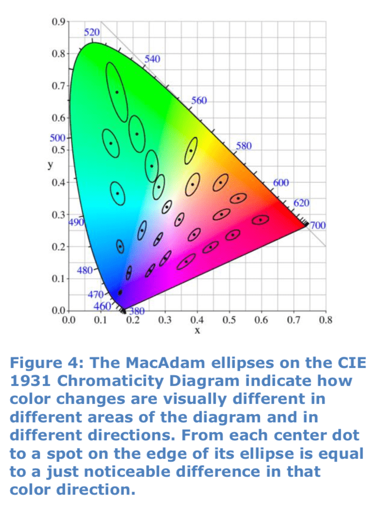
The problem was that the CIE 1931 Chromaticity Diagram that was being used at the time was not perceptually uniform. It was not a perfect model of human color perception. A difference of 0.003 in the CIE 1931 x coordinate, for example, is much more visible for some colors than for other colors.
Figure 4 shows some of the MacAdam ellipses for the CIE 1931 Chromaticity Diagram. For each of the center dot colors, the ellipses that surround each dot indicate the combination of measured x and y differences that produce a visual just noticeable difference (JND) from the center color.
You can see by examining the MacAdam ellipses, a certain difference in the x direction will be significantly more noticeable for some colors than for other colors (e.g. human vision is very sensitive to small blue xy differences, but not to small green xy differences). Also, you can see that, for most colors, a certain measured variance in the x direction will have a different visual significance than the same variance in the y direction.
Delta E
In 1960 the CIE updated the CIE 1931 xy Chromaticity Diagram to the moderately more uniform CIE 1960 uv Chromaticity Diagram. While the 1960 uv diagram is more uniform than the 1931 diagram, it is still of limited value for determining color differences. The two dimensional 1960 uv diagram, like the 1931 diagram, indicates only the hue and saturation of a color, ignoring the effects of luminance, which is needed to fully define a color.
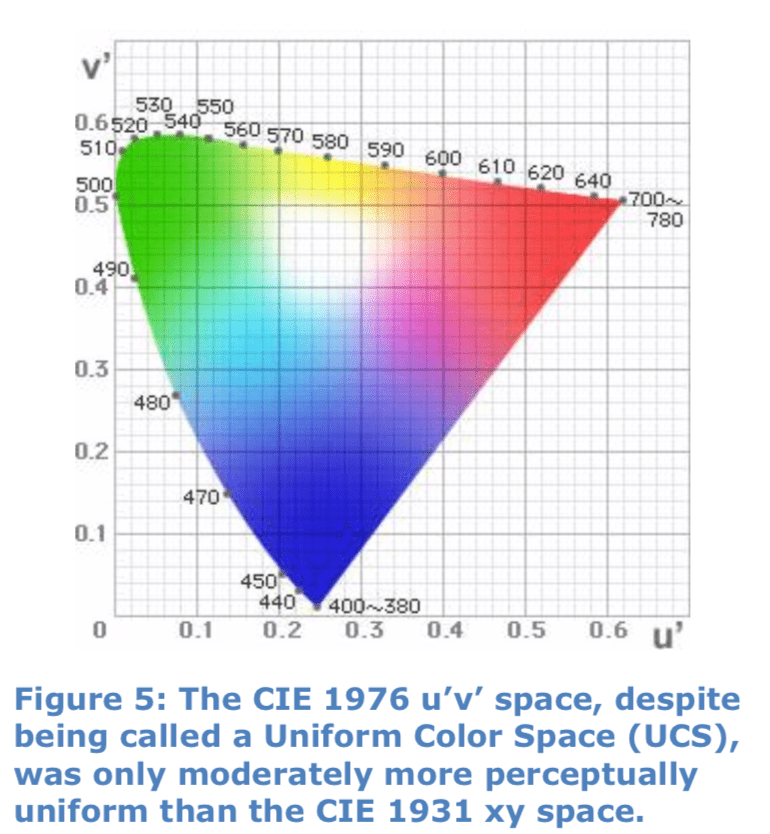
In 1976, the CIE introduced the CIE L*A*B* color space (abbreviated CIELAB) and the CIE L*u*v* color space (abbreviated CIELUV), both three-dimensional color spaces. A two dimensional 1976 u’v’ chromaticity diagram was additionally provided, to visualize hue and saturation in the CIELUV space (Figure 5).
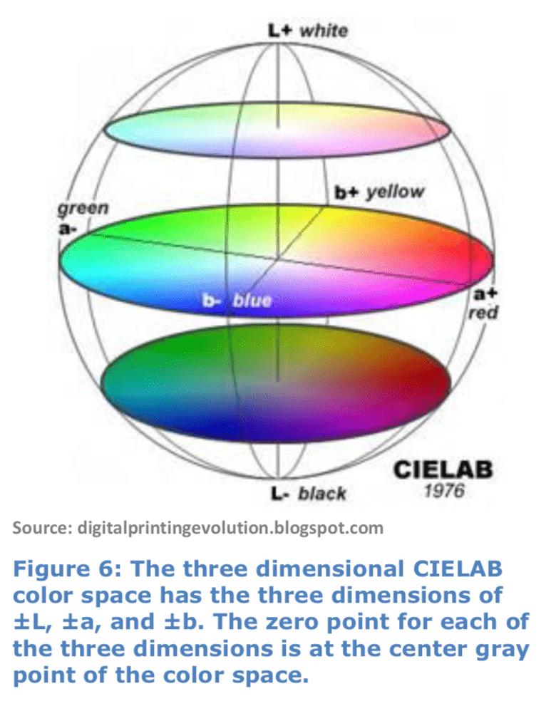
The three dimensional CIELAB color space, which was intended to be perceptually uniform, is best visualized with a three dimensional graphic (Figure 6). The CIELAB color space does not have an associated two dimensional chromaticity diagram.
The dimensions for CIELAB color space consist of “L” (bright/dark axis), “a” (red/green axis), and “b” (yellow/blue axis). A positive value of “a” describes the redness of the color, a negative “a” the greenness. Similarly, a positive “b” denotes yellow, and a negative “b” denotes blue.
In 1976, CIE also introduced a distance metric “Delta E” (also called ΔE, or dE), based on the CIELAB color space. The Greek letter Delta (the symbol Δ) is used to indicate a difference and E stands for the German word Empfindung, meaning “sensation.” So, “Delta E” literally means “difference in sensation.” (Note: A difference of 0.001 in only one CIE color space dimension equals 1 Delta E.)
The introduction of Delta E was an attempt to numerically model the color difference response of human vision. Delta E 1976 LAB is the straight-line numeric ‘distance’ between two colors in the CIELAB three-dimensional color space.
The intent was that 1 dE would represent the visual color difference between two colors, which are not touching each other, which is just perceptible to the average human observer (1 JND). (Note that human vision is more sensitive to color differences if two colors touch each other.)
The display industry didn’t immediately embrace the three-dimensional CIELAB color space or Delta E 1976 LAB, however. Since the two dimensional CIE 1976 u’v’ chromaticity diagram (Figure 5) was closer in concept to the CIE 1931 xy chromaticity diagram (Figure 4) with which the display industry was first familiar, the industry first used dE u’v’ to model the visual differences in chromaticity between two colors (ignoring luminance differences). For critical color difference specifications, though, the display industry eventually began using Delta E 1976 LAB.
Perceptual Uniformity
s the CIELAB color space began to be used, it was found that CIELAB was not as perceptually uniform as CIE intended (Figure 7). In different areas of CIELAB space, similarly perceived visual differences still resulted in different dE values. Likewise, the same dE values may result in different perceived visual color differences.
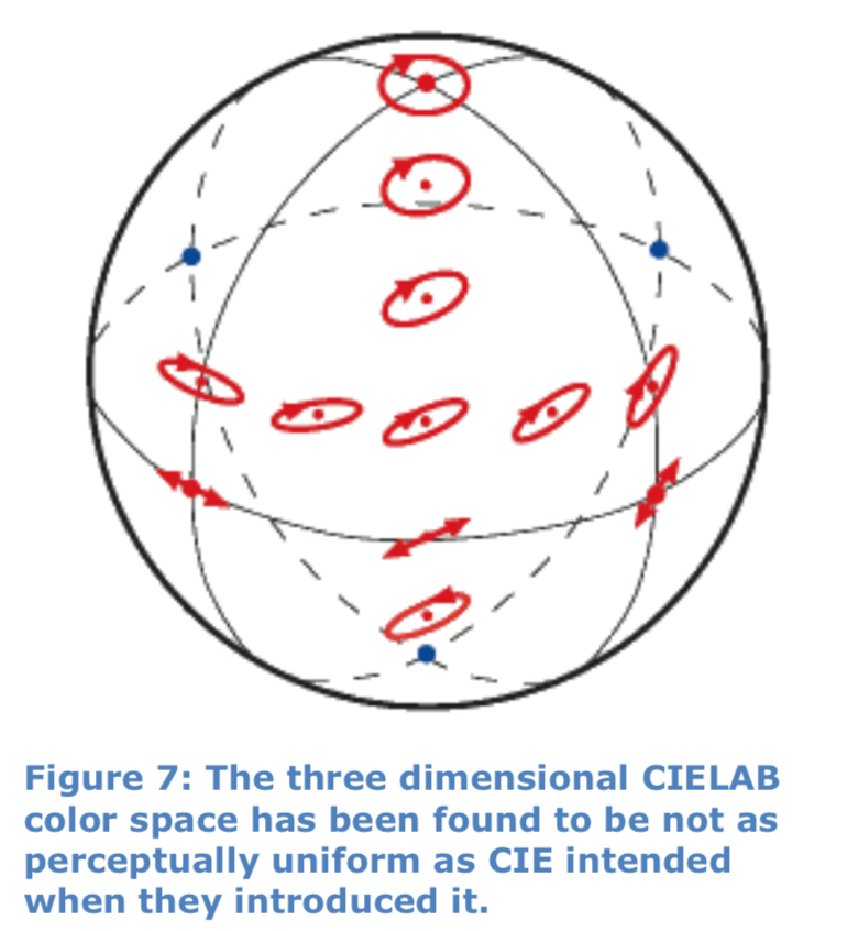
CIELAB 1976 Delta E suffers from the same remaining perceptual non- uniformities as the CIELAB color space upon which it is based. Studies have shown that in the CIELAB space, rather than 1 Delta E always equaling 1 JND, there are still different values of Delta E per JND for different colors. A study by Mahy et al. in 1994 assessed an average of 2.3 ΔE per JND.
Experience has shown that with the CIE 1976 Delta E formula, color differences of 1 dE for saturated colors are not normally visible to an untrained eye. However, color differences of 1 dE for neutral gray colors are normally visible.
Also, CIELAB space doesn’t account for the different sensitivities of the human visual system to hue, saturation, and lightness differences.
Delta E Updates
In 1994 and again in 2000, the CIE revised their Delta E formula to more uniformly emulate human visual perception throughout the visible color space.
Since the 1994 update did not adequately resolve the perceptual uniformity issue, the CIE refined their definition for dE2000, adding five corrections:
- Independently varies the weighting of hue within the LAB space
- Independently varies the weighting of chroma within the LAB space
- Independently varies the weighting of lightness within the LAB space
- Varies the weighting of Blue hue
- Changes the weighting for neutral gray colors
These corrections allow dE2000 to better model the interrelated effects of hue, chroma, and lightness on human color perception. Although there remain some non-uniformities, Delta E 2000 is now considered the most accurate color difference metric to use for small Delta E calculations (<5 dE).
Color Comparison Today
Today, a wide range of colorimeters and spectrophotometers are available to accurately measure the SPD of commercially available projectors and direct view displays. Any remaining technical deficiency of modern light measurement instruments is not a significant issue for video display users and calibrators. Also, since Delta E was first introduced, the color measurement industry has steadily designed better and better ways to measure color matching and color differences.
However, since Delta E still does not absolutely correlate to visible color difference for all colors and, since dE is an unfamiliar concept for some, it is not always as intuitive to use as we would like. In many situations, visual color difference evaluation continues to be a valuable tool for evaluating video displays.
Visual Comparison Advantages
The end criterion for image rendering is that colors need to appear correct according to human vision. The original method of using optical comparators to gauge whether a color of gray was sufficiently close to a reference gray was inherently correct. It used the human visual system as the final arbiter of color accuracy, as it will always be.
Visual color comparison doesn’t rely on Delta E calculations to attempt to quantify human color perception as a set of numbers. Instead, it uses human vision to directly compare any differences between a rendered display color and the desired target color. Visual comparison allows human perception to subjectively evaluate which color differences are acceptable and which are excessive.
Delta E numbers representing color differences don’t allow you to easily make those decisions, especially because even dE2000 is still not perfectly uniform throughout color space. For some colors, a difference of 3 dE may be acceptable, whereas for other colors, differences over 1 dE may be unacceptable.
Visual color comparison allows you to see which colors a display renders accurately and which colors are less accurate. It allows you to decide whether the colors that are critical in your application are sufficiently accurate.
Delta E is helpful in quantifying color rendering performance, but direct visual color comparison is the ultimate proof for evaluating video displays and for obtaining more accurate color rendering performance.
ColorChecker Chart
The ColorChecker Color Rendition Chart was developed in 1976 by C. S. McCamy, H. Marcus and J. G. Davidson, who were employed by Macbeth (now merged into X-Rite). The chart contains “24 scientifically prepared natural, chromatic, primary and grayscale colored squares in a wide range of colors” (Figure 8).
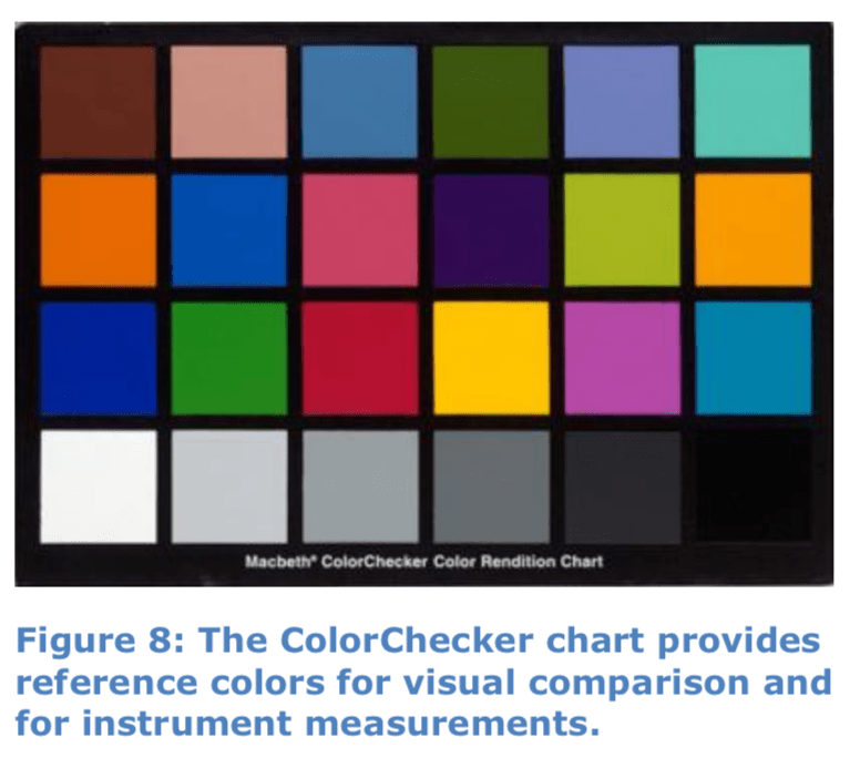
The ColorChecker chart was created to help users check image display and printing processes, correct white balance, and perform camera color correction. The colors on the ColorChecker chart were each selected as the color of a real-life object under various lighting conditions. The chart contains grayscale tones, human skin, blue sky, citrus fruit, foliage (flowers and leaves), and the RGBCMY primary and secondary colors.
X-Rite also developed the ColorChecker Digital SG in 2005, with 140 color patches (Figure 9). The expanded ColorChecker SG chart is intended to provide a more representative reference for the colors normally contained in digital images.
The ColorChecker SG chart was expanded from the ColorChecker Classic chart, to provide a larger color gamut, a wider variety of skin tones, and a greater variety within color groups.
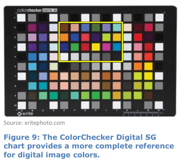
The SG chart contains 96 unique colors, with the 24 colors from ColorChecker Classic (outlined here in yellow), 17 unique grayscale steps, and 14 unique skin tone colors.
The ColorChecker Classic and ColorChecker SG charts provide an intuitive method to recognize and evaluate the many factors that can affect color reproduction, by visually comparing reproduced colors from the charts to the actual ColorChecker colors.
Calman Color Comparator™
Calman Display Calibration Software includes Color ComparatorTM charts, which allow video display users and calibrators to easily compare the relative visual difference between desired target colors and actual measured colors. The Calman Color Comparator™ allows users to visually check a display’s color rendering accuracy, either before or after display calibration.
The Calman grayscale Color Comparator (Figure 10) shows the differences between a display’s measured colors of gray and the desired target gray colors. The Color Comparator provides a visual comparison function that is similar to previous grayscale optical comparators.
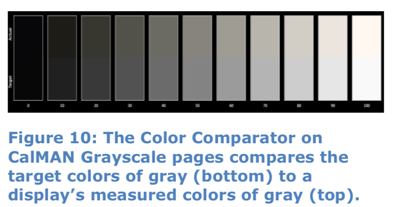
Color measurement instruments are used to develop and present the Color Comparator visual comparisons. Then, human vision is used to evaluate whether a display’s grayscale colors appear correct next to target values.
This removes any questions or confusion that may arise over dE values for display performance measurements. Delta E provides a numeric evaluation of the difference between the target color and actual color. The Color Comparator allows users to actually see the difference, to know whether the human visual system will be satisfied with a display’s color rendering performance.
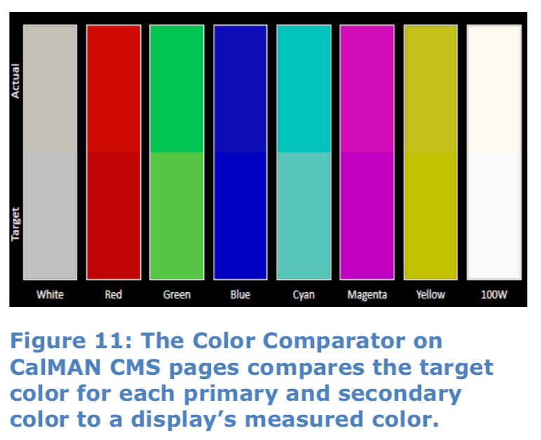
Calman also provides a CMS Color Comparator to visually check the accuracy of a display’s primary and secondary colors (Figure 11).
Using Color Comparator
After measuring or calibrating a display’s grayscale or CMS, just view the Color Comparator on the Calman Grayscale and CMS calibration pages.
The Color Comparator gives a true representation of the visual color error. Even if the Delta E is questionable for one or more colors, the Color Comparator lets you actually see whether there is a significant visual difference.
If there is a significant visual difference, it may be worthwhile calibrating the display to tighter tolerances to reduce the color difference. If no color difference is visible, no matter what the dE is, the color rendering accuracy is good.
In many cases, the Color Comparator may show that trying to get dE down to very low values is not worth the effort, when there is no visible effect once you get dE below a certain value.
Even if you are viewing the Color Comparator on an uncalibrated laptop monitor, Calman maintains visual accuracy by scaling the results into the probable gamut range of a calibrated computer, while maintaining the relative visual difference between target and actual colors.
The Color Comparator maintains the chromaticity and luminance differences between the target and actual colors so that you can make accurate visual assessments.
As compared to other color charts and numeric color difference metrics, the Color Comparator is instantly intuitive. No one ever needs an explanation of the visual comparison between target colors and measured colors. They just instantly ‘get it.’
Calman ColorChecker
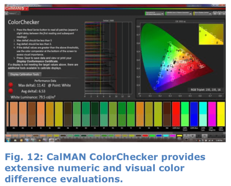
Calman ColorChecker provides an expanded check of a display’s color performance by sending the standard ColorChecker chart colors to the display under test and measuring the display colors. Calman then analyzes and displays the results in a number of ways; as Delta E color difference values, plotted on a CIE chart, and rendered on an expanded Color Comparator chart (Figure 12).
ColorChecker Classic
Calman ColorChecker uses the 24 ColorChecker Classic grayscale and color critical values to evaluate a display’s performance before or after calibrating the display’s grayscale and gamut (Figure 13).
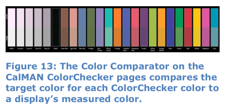
Since most displays do not render color saturation levels perfectly linearly, we use these colors to analyze the display’s color accuracy for critical colors within the display’s color space, as well as for the fully saturated primary and secondary colors at the edges of the display’s color space.
ColorChecker SG
With Calman ColorChecker, users can select between measuring the ColorChecker Classic colors or the expanded ColorChecker SG colors.
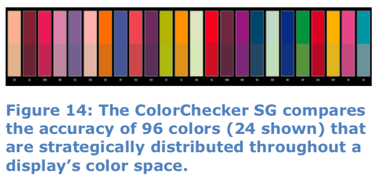
The ColorChecker SG selection checks 96 reference colors, giving an even more detailed color analysis of a display (Figure 14). These 96 colors include 13 flesh tones, so you can see at a glance exactly how well a display renders this critical segment of color space.
Calman Color Comparator Availability
Calman Enthusiast and all professional levels of Calman include the Color Comparator visual color comparison charts.
The Calman Color Comparator charts are currently available in the Calman Quick Analysis, SI Professional, Color Cube (3D LUT), Monitor, and ColorChecker workflows, and will soon be available in the other main Calman workflows.
Summary
Direct visual color comparison has long been accepted as a valid and valuable method for evaluating the color rendering accuracy of video displays. This began with the first optical comparators that were used to evaluate and adjust grayscale accuracy. Optical comparators demonstrated that visual color comparison was an intuitive and accurate method for checking and adjusting the color difference between a reference target color and that same color, as rendered by a display.
With the increasing variety of available display technologies, electronic evaluation of color difference was introduced (Delta E), as were new color measuring devices. This was an effort to numerically model the color difference response of human vision. It was intended to remove the subjectivity from color difference evaluation and to facilitate numeric color accuracy documentation. However, the perceptual non-uniformity of existing Delta E formulas, plus the non-intuitive correlation between color differences and numbers precludes Delta E from being the ultimate tool for color difference evaluation.
The Color Comparator charts in Calman ColorChecker and other workflows provide a direct visual comparison between desired target colors and a display’s actual measured colors, hearkening back to the intuitive analysis of the first optical comparators.
This modern visual color comparison uses a color probe to measure a display’s performance and then develop direct visual color comparisons. These visual color comparisons let you actually see a display’s color errors to intuitively decide which color differences are acceptable and which are excessive.